
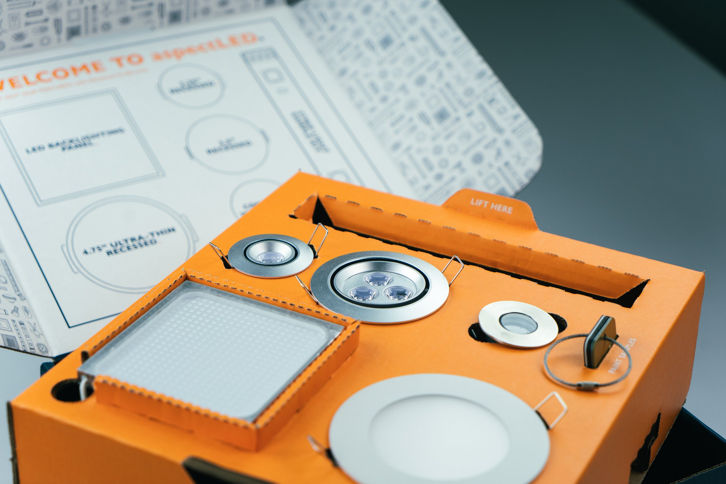
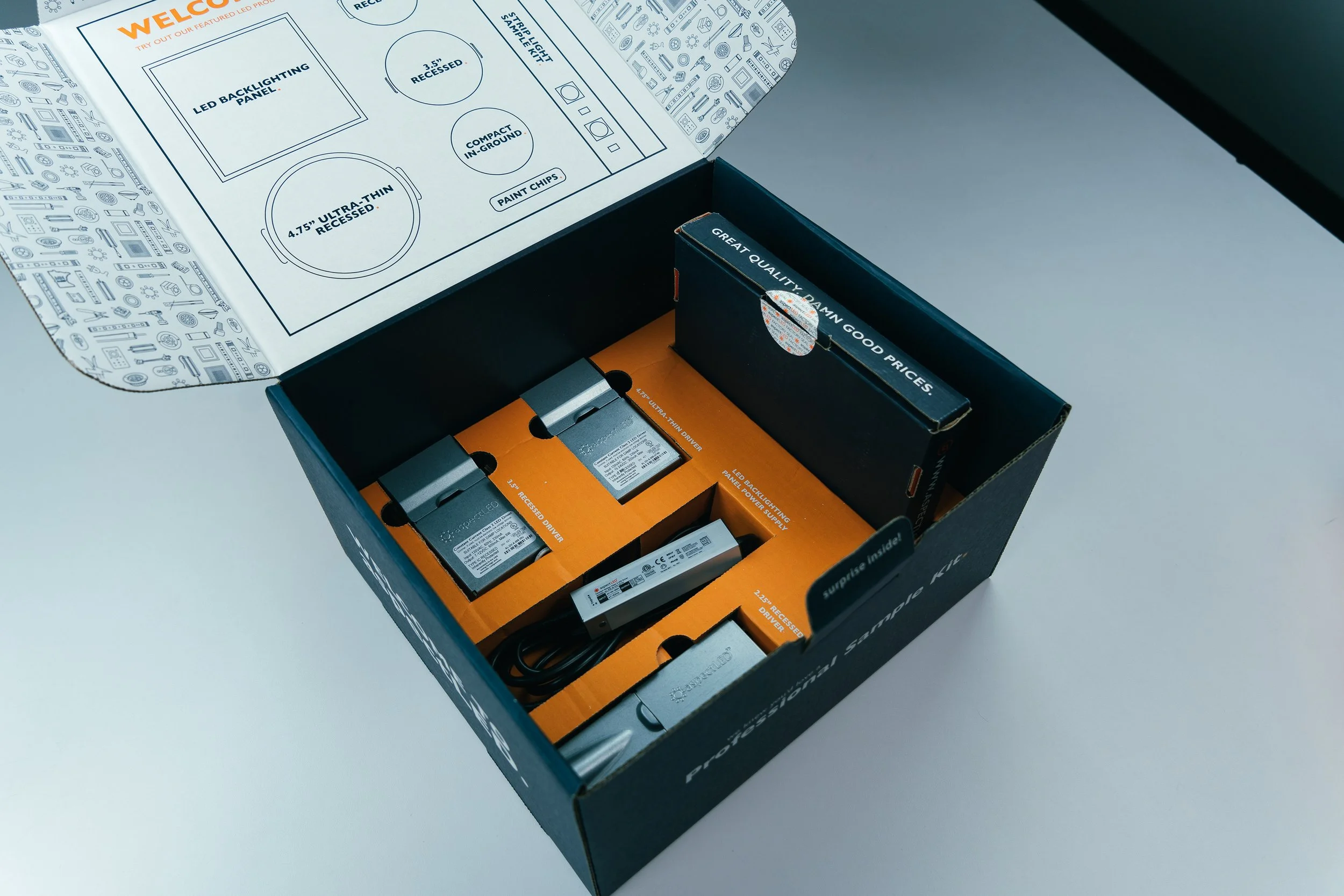
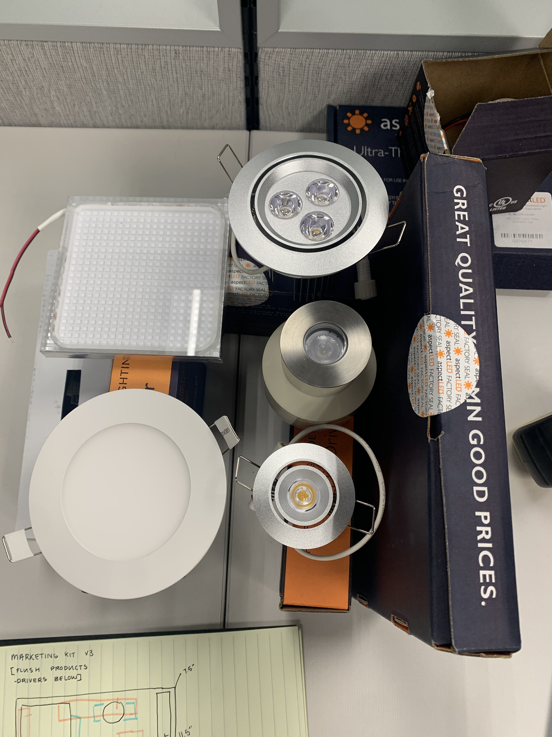
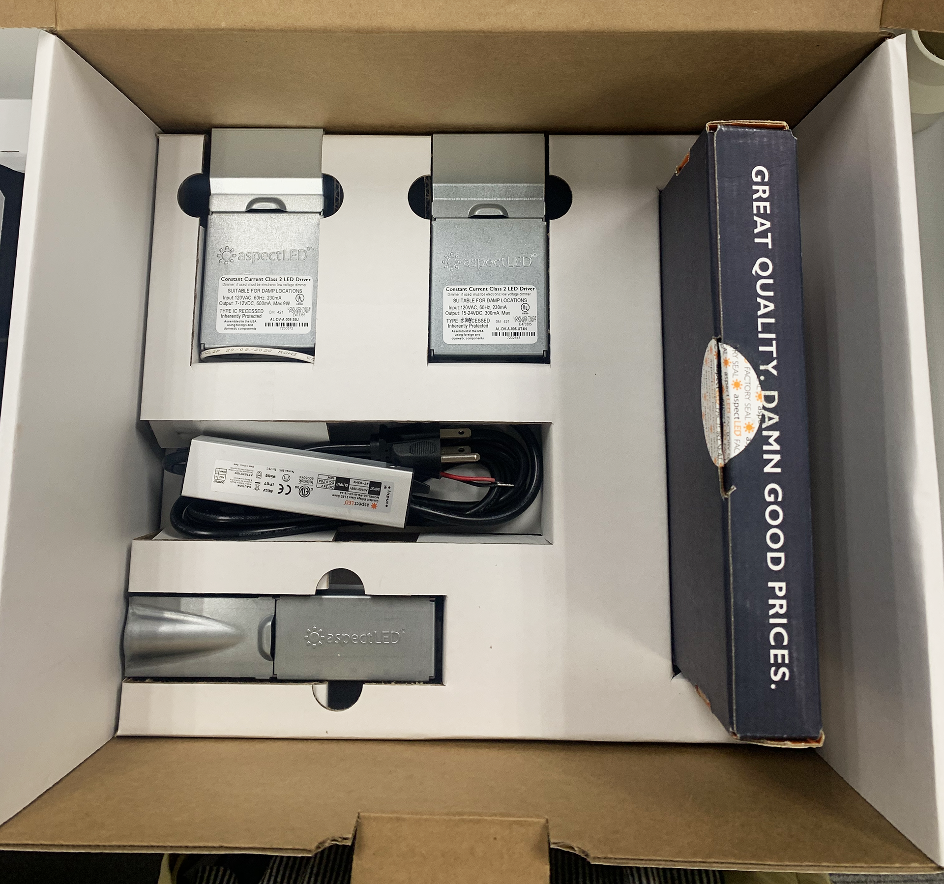
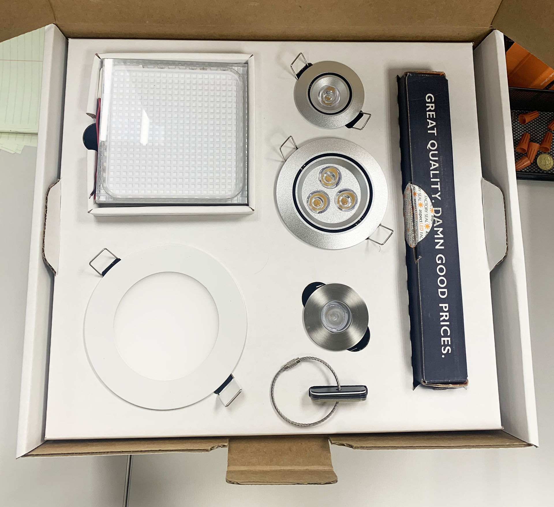
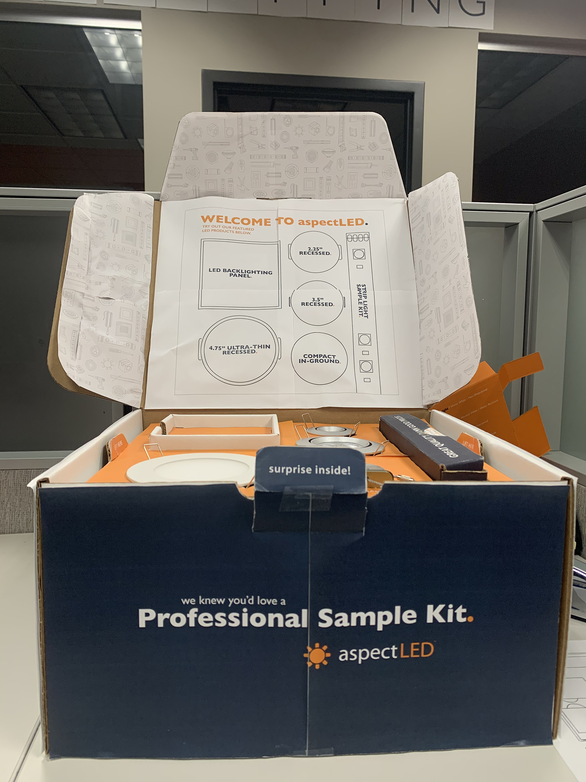
As a part of my internship at aspectLED, I had the opportunity to design their product marketing kit. This was such an exciting project and was aimed towards future customers to show them aspectLED's top products. The box is designed so that the products are flush on the top layer with the drivers to light them up beneath it. This project was very user-centered in nature and focused on the details of the experience.

THE PROCESS:
Step 1: Empathize, Identify & Ideate
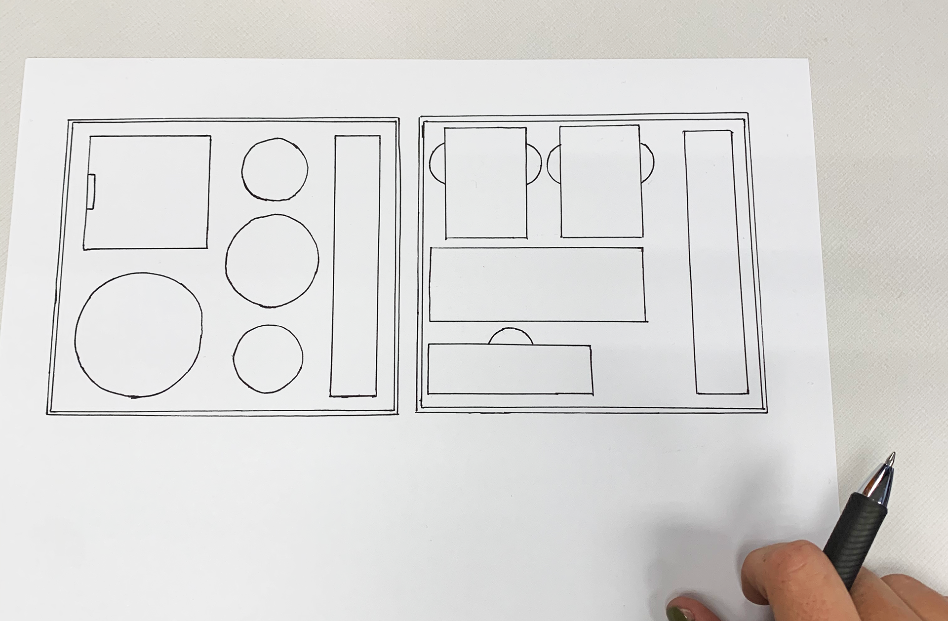
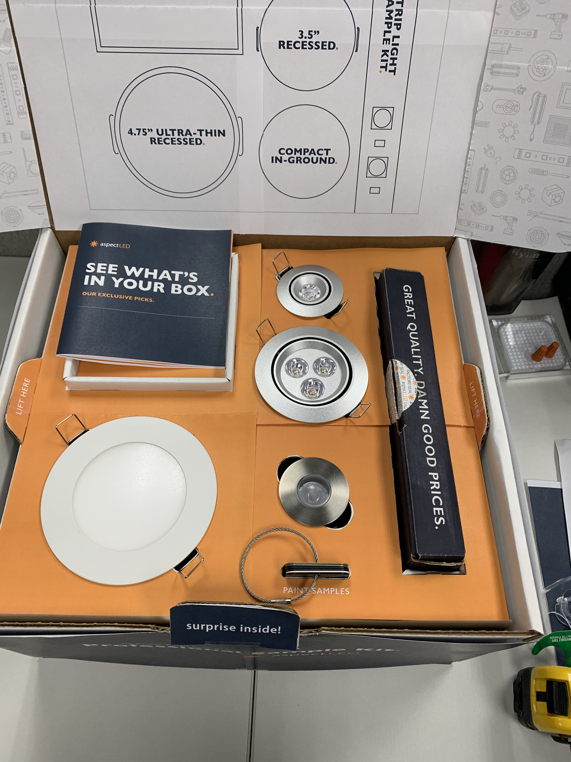
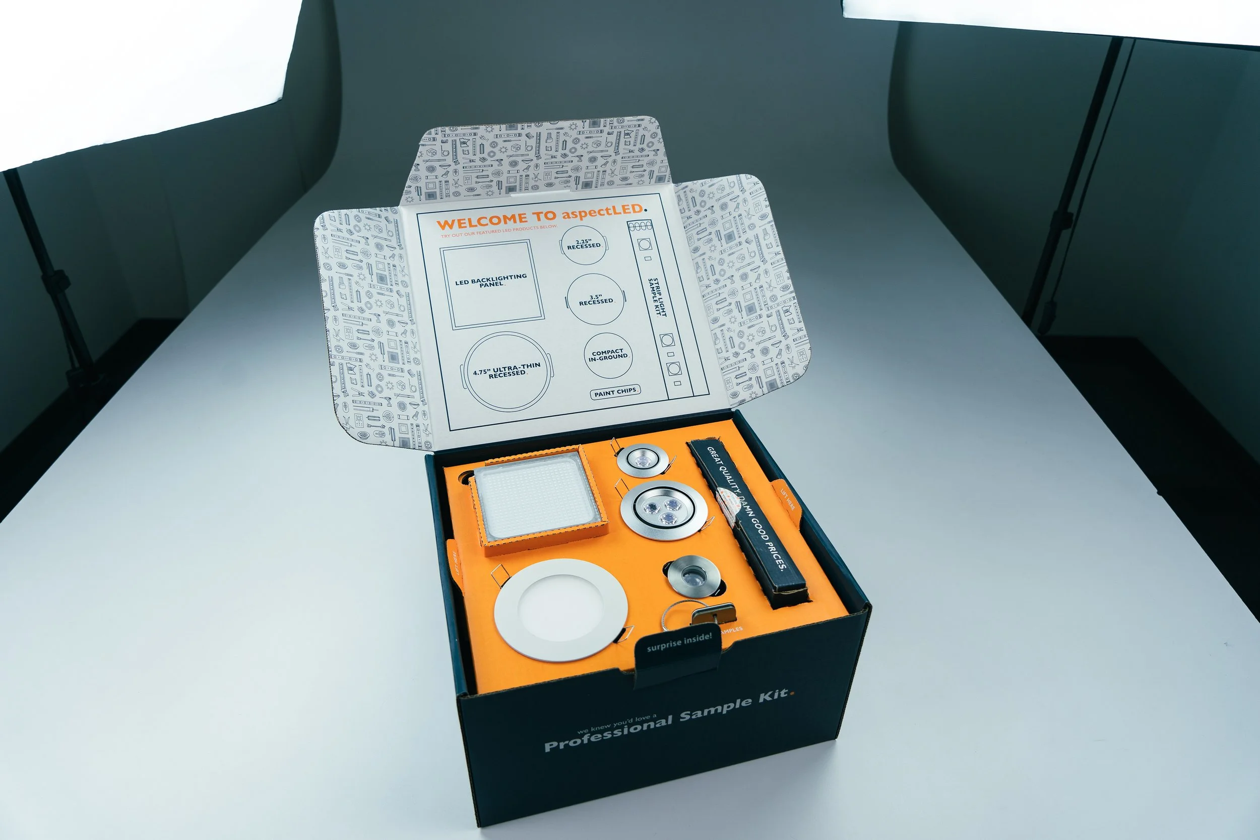
The requirements of this marketing kit were the 5 lighting products, sample kit, and paint chips. Each lighting product also required a driver to go along with it, needing 4 drivers to fit in the box somewhere. With this scope in mind, I began to sketch spacial ideas of how all these circular and space components would fit together cleanly in a box, while also making it an experience to open. I ideated three layout concepts. After feedback and critiques, the clear first choice was a flush-faced design with the lights on the top and drivers underneath.
Step 2: Prototype
After feedback and revisions, we met with a corrugated box designer to see if the complex die-cutting and flush-face could be achieved. Having die-cut platforms for each light, a two tiered box with the sample kit fitting in the bottom, and drivers underneath were all doable. A few things were tweaked once we received the first box prototype. We added the paint chips and added some additional spaces so that the lights could go in and out of their "platforms" with ease.
Once the layout and design of the box was flushed out, I began to think through the art outside and inside of the box.
Step 3: Testing
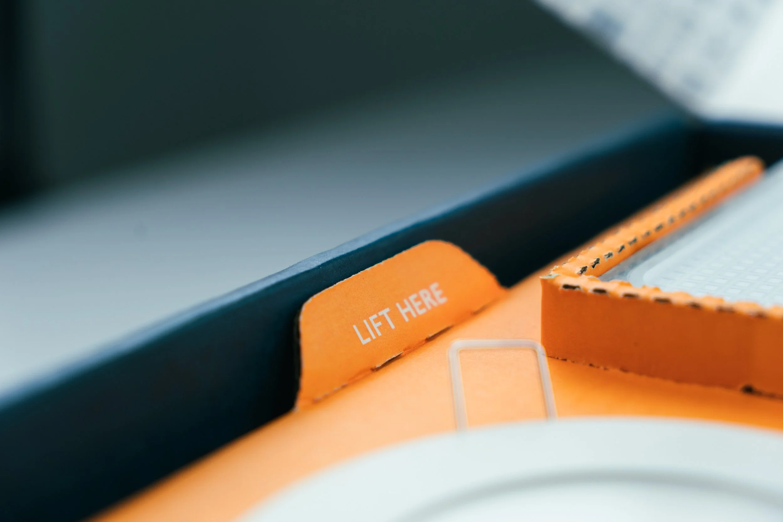
The layout and user experience of the box were solidified before I began creating the visuals of the packaging. After feedback and revisions, I printed out a draft of the artwork for each box side, inside, and flaps. From there, the white prototype box was used to test different visual cues such as "lift here"'s and "surprise inside". Good ol' exact knife and taping time.
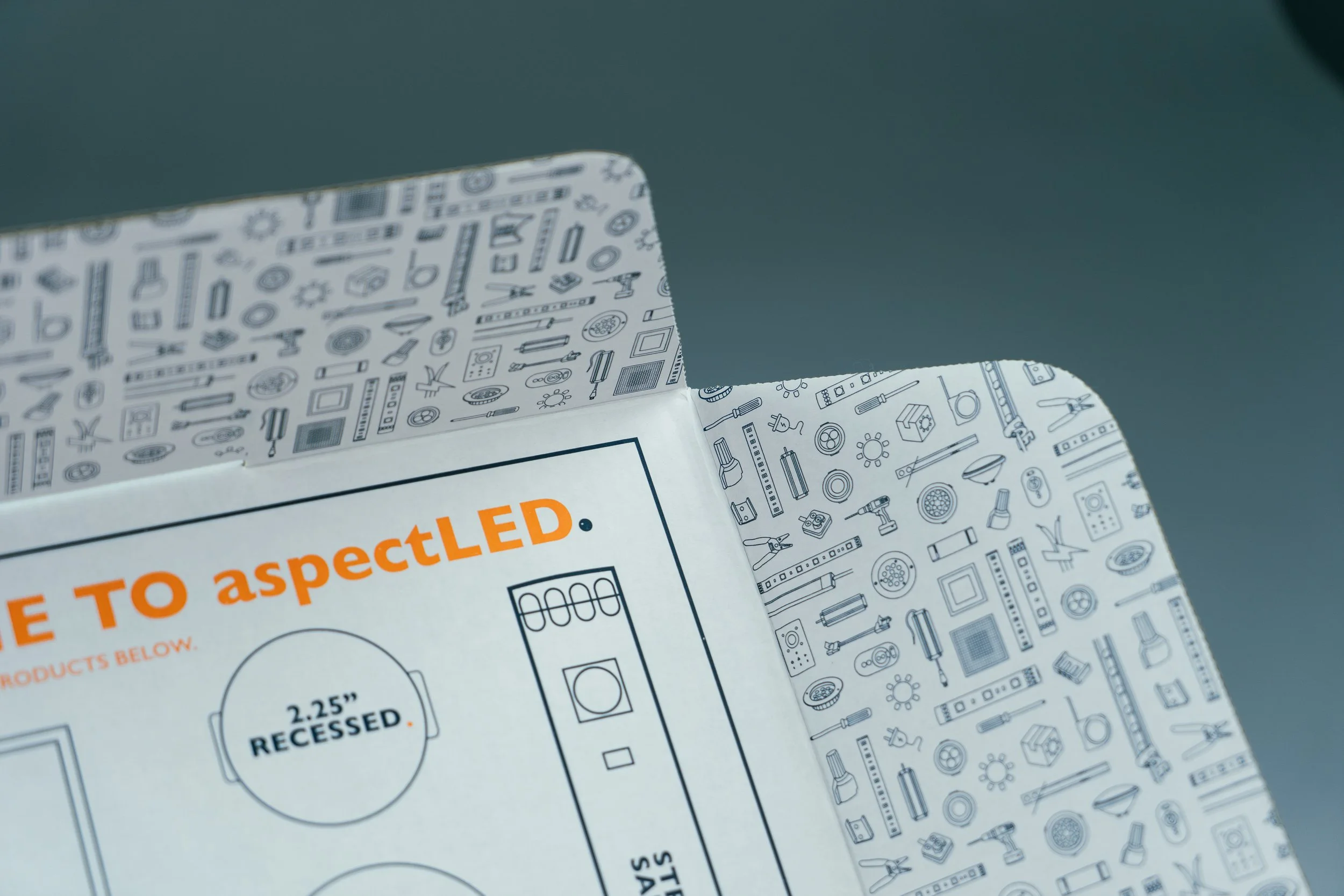
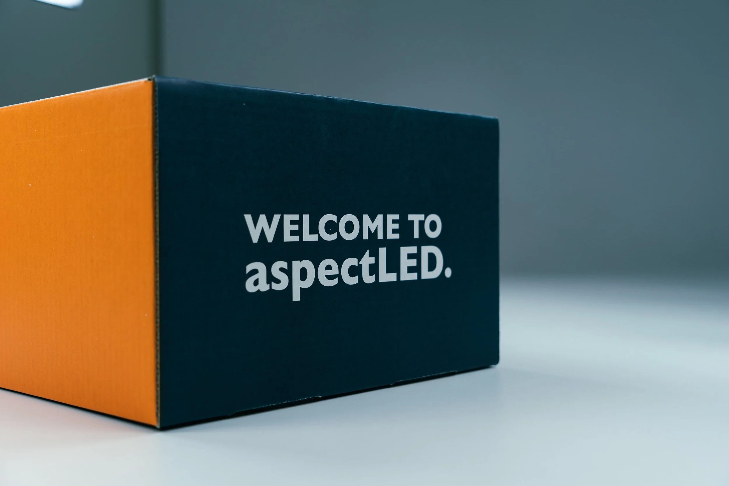
Normally with packaging, all of the negative space is filled with the numerous amounts of important information. But with this marketing kit, we wanted it to feel special. The purpose of this box was to be bold and show off the quality of the products, really letting them speak for themselves. The final artwork was clean and simple on the outside with minimal details on the inside to emphasize this.
Step 4: Final Design
As seen above, the final design ended up looking like this. Clean and sophisticated, yet special and friendly.