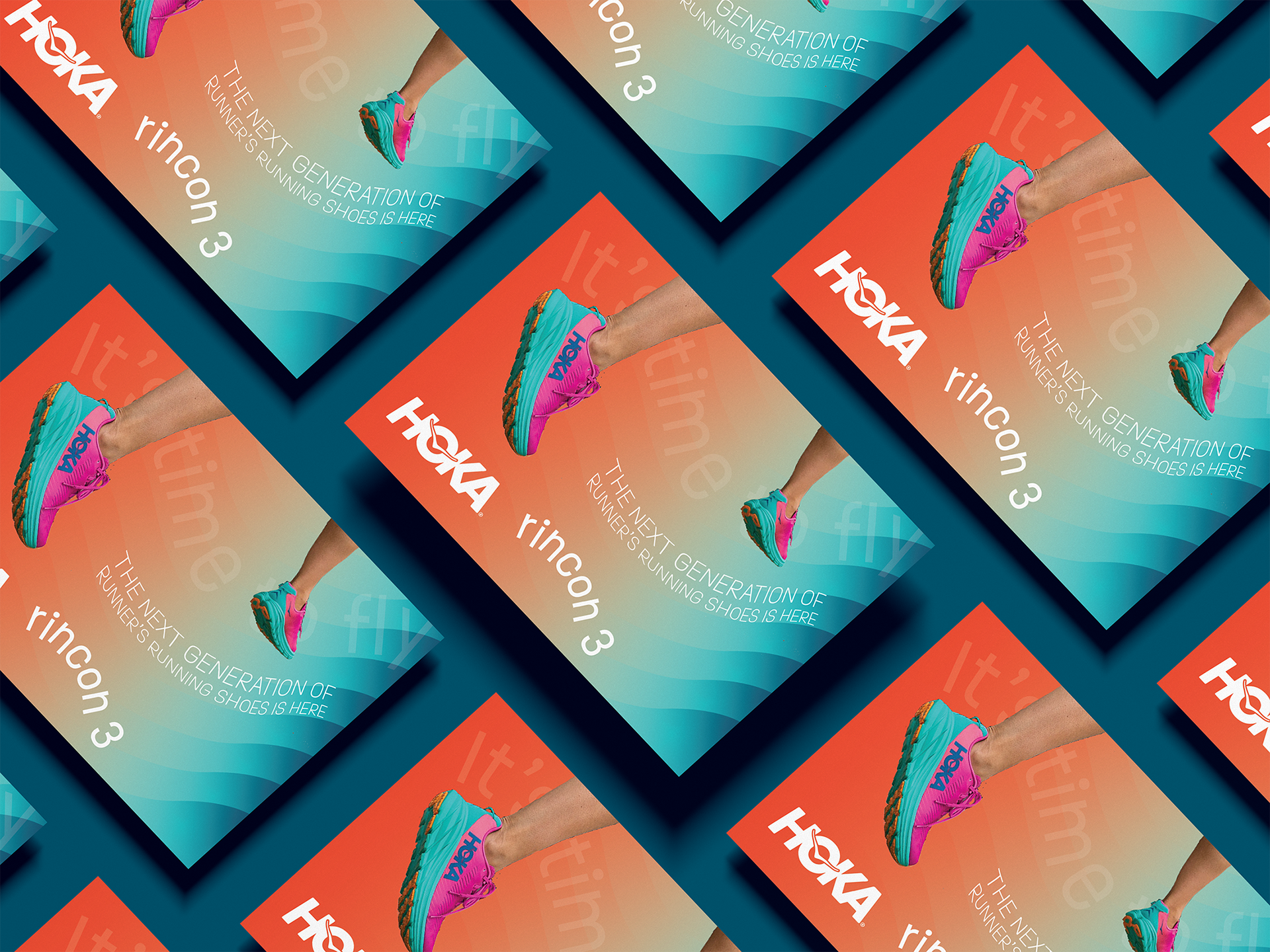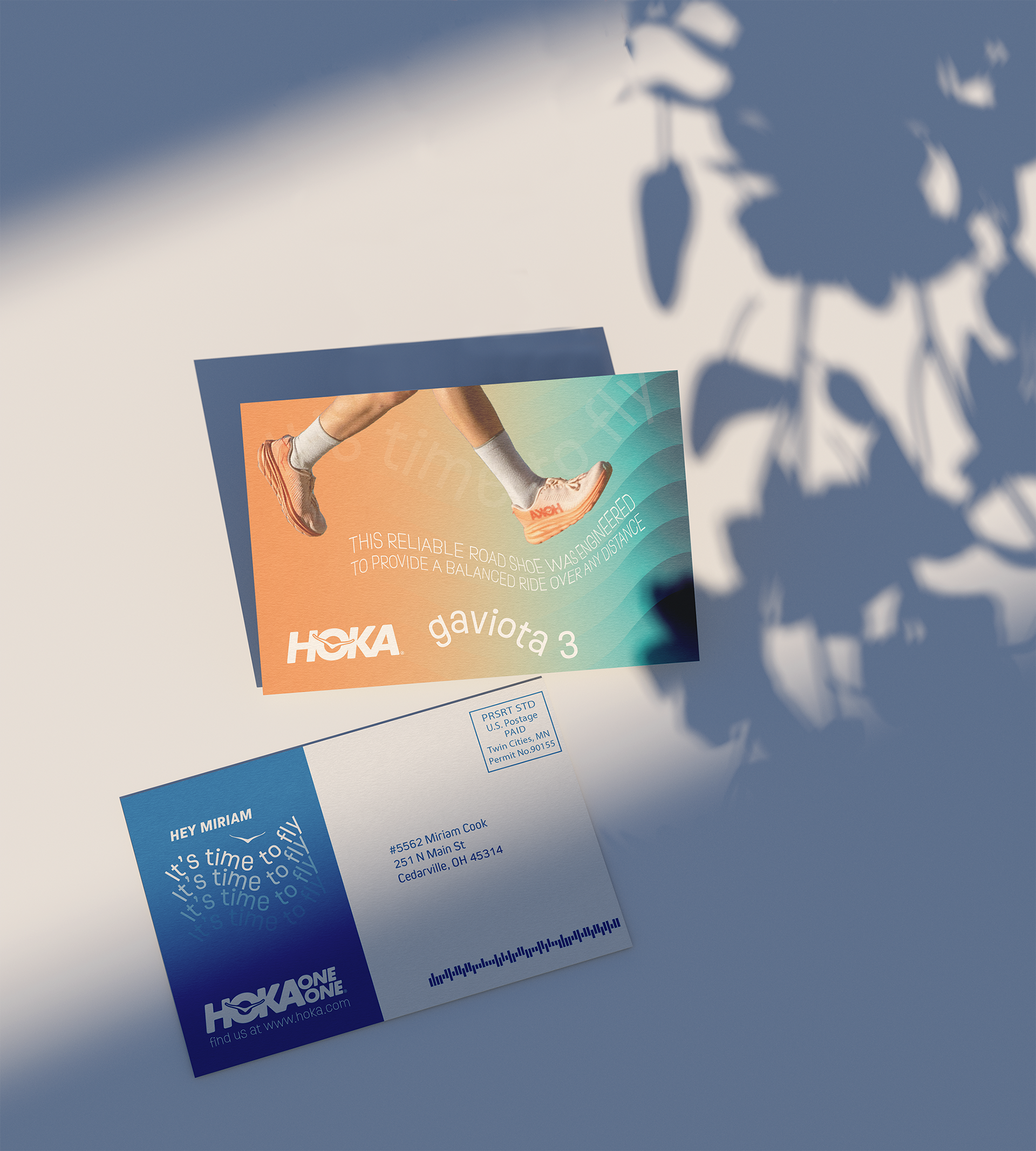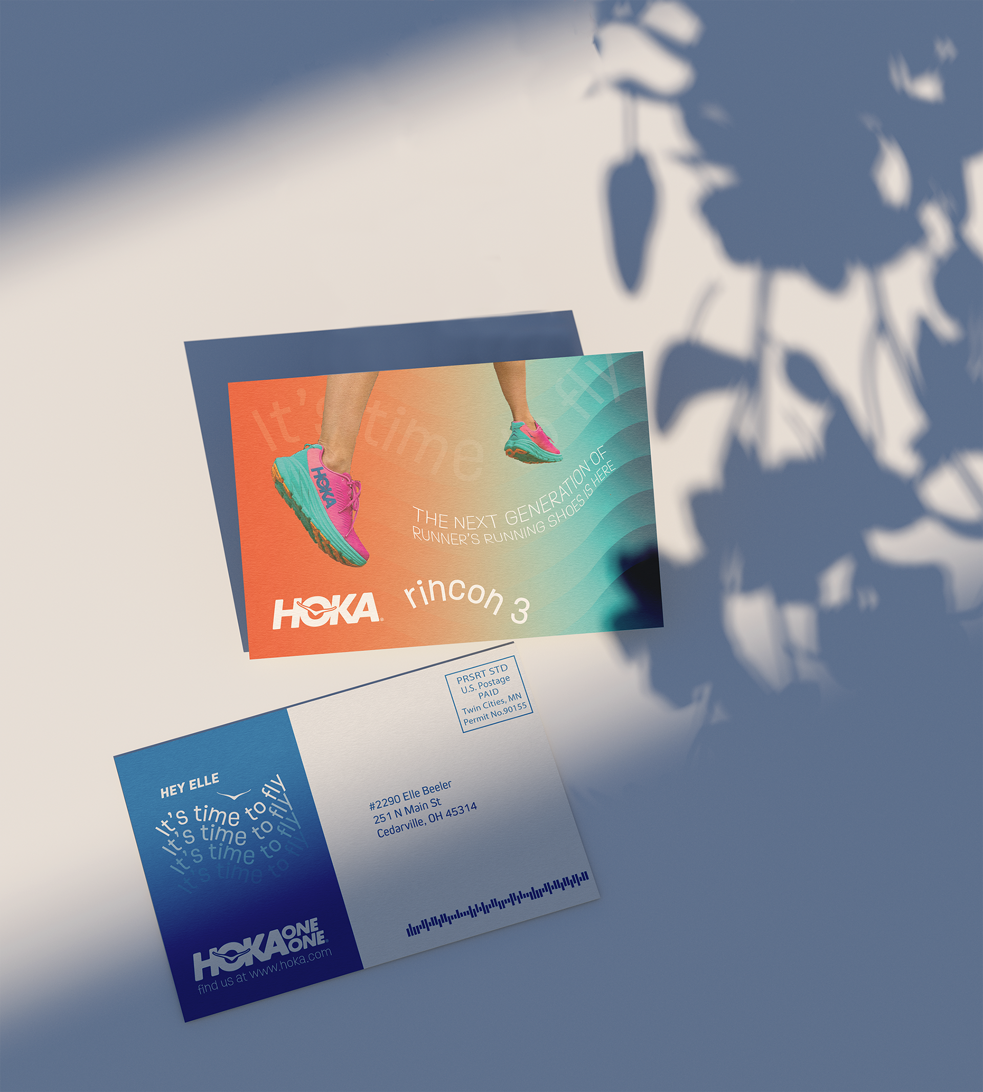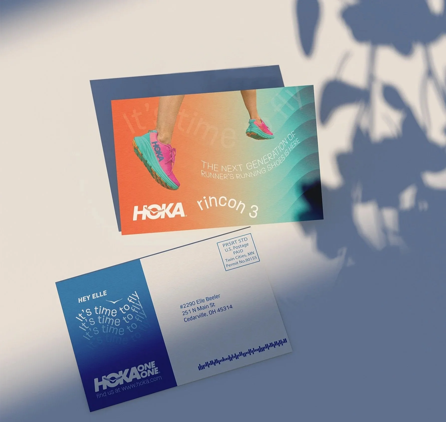
HOKA PRINT MAILER
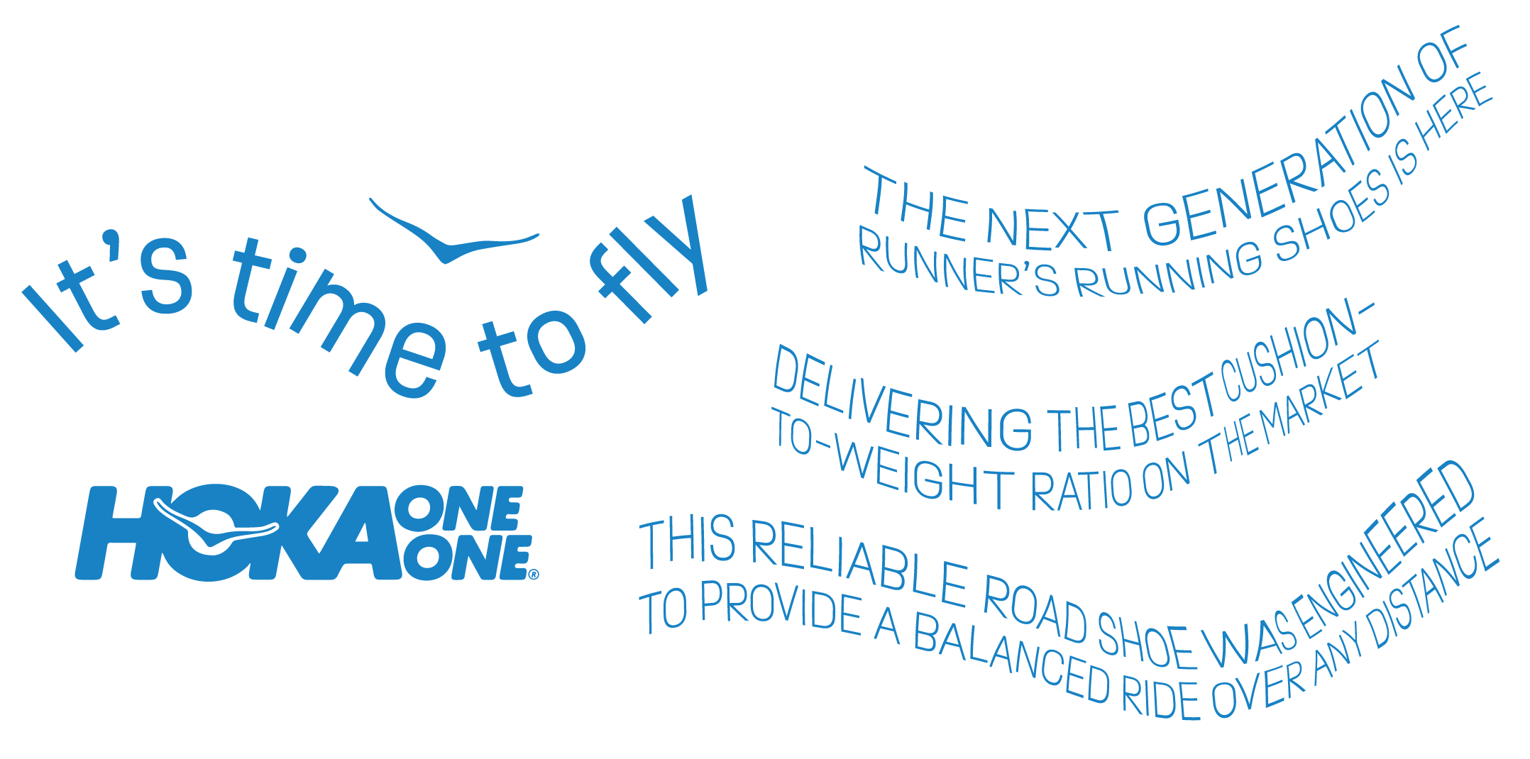
For this project, the goal was to create a postcard that used variable printing data to promote a product, and I chose HOKA for its vibrant branding and energetic personality. I leaned into their signature sky blue and bold gradients, using the tagline “It’s Time to Fly” as inspiration for the sense of movement that defines the piece. Curved type, subtle distortion in the product descriptions, and repeated gradients and taglines all work together to evoke motion, rhythm, and the airy, cloud-like feel associated with HOKA’s running shoes.