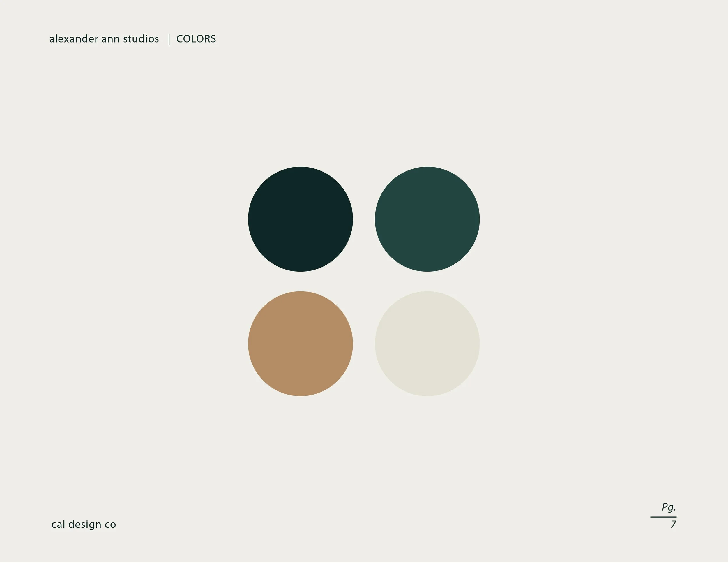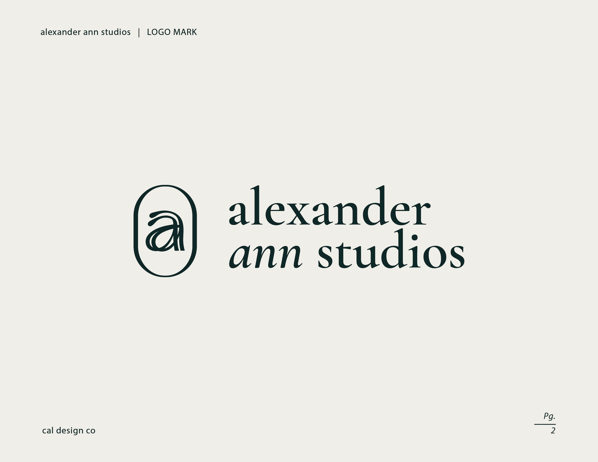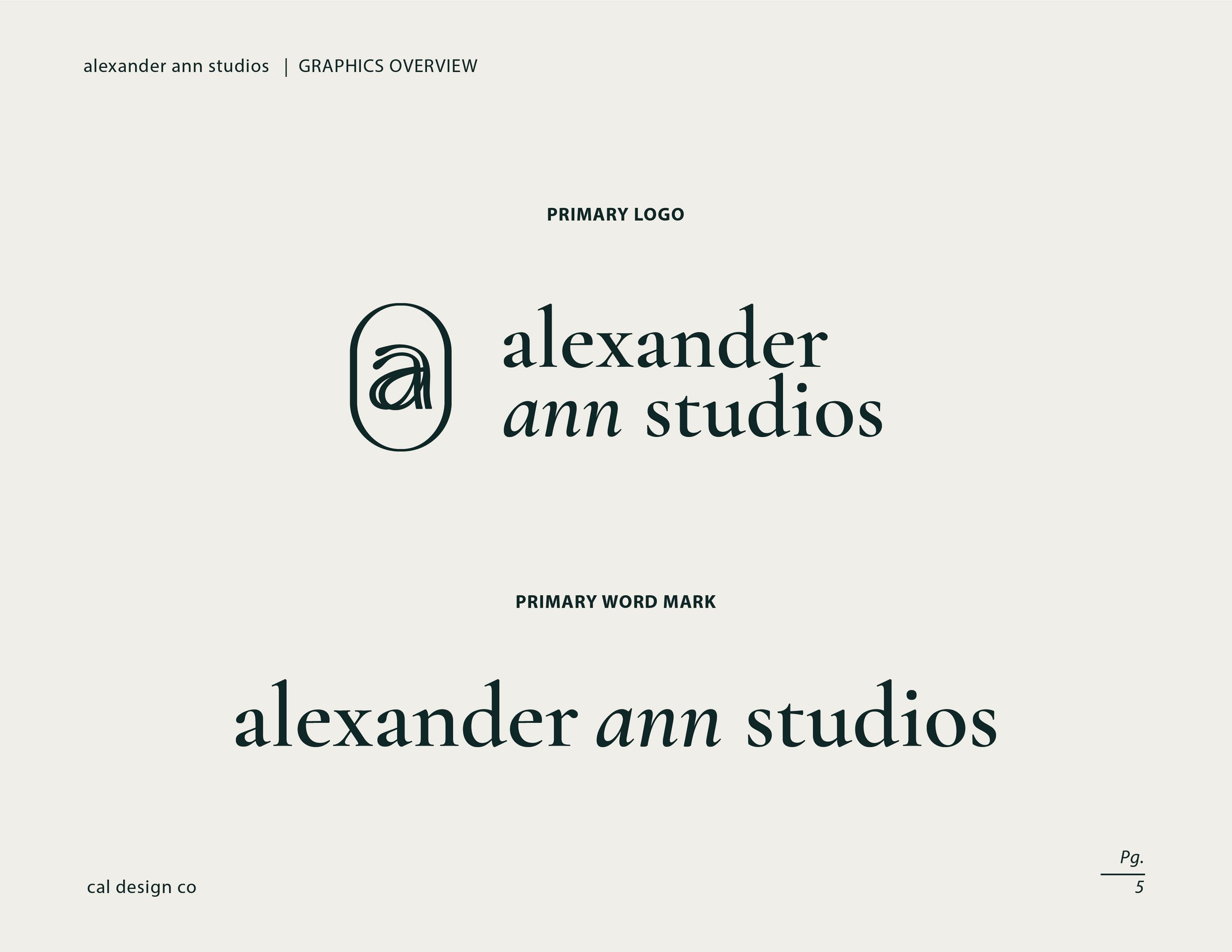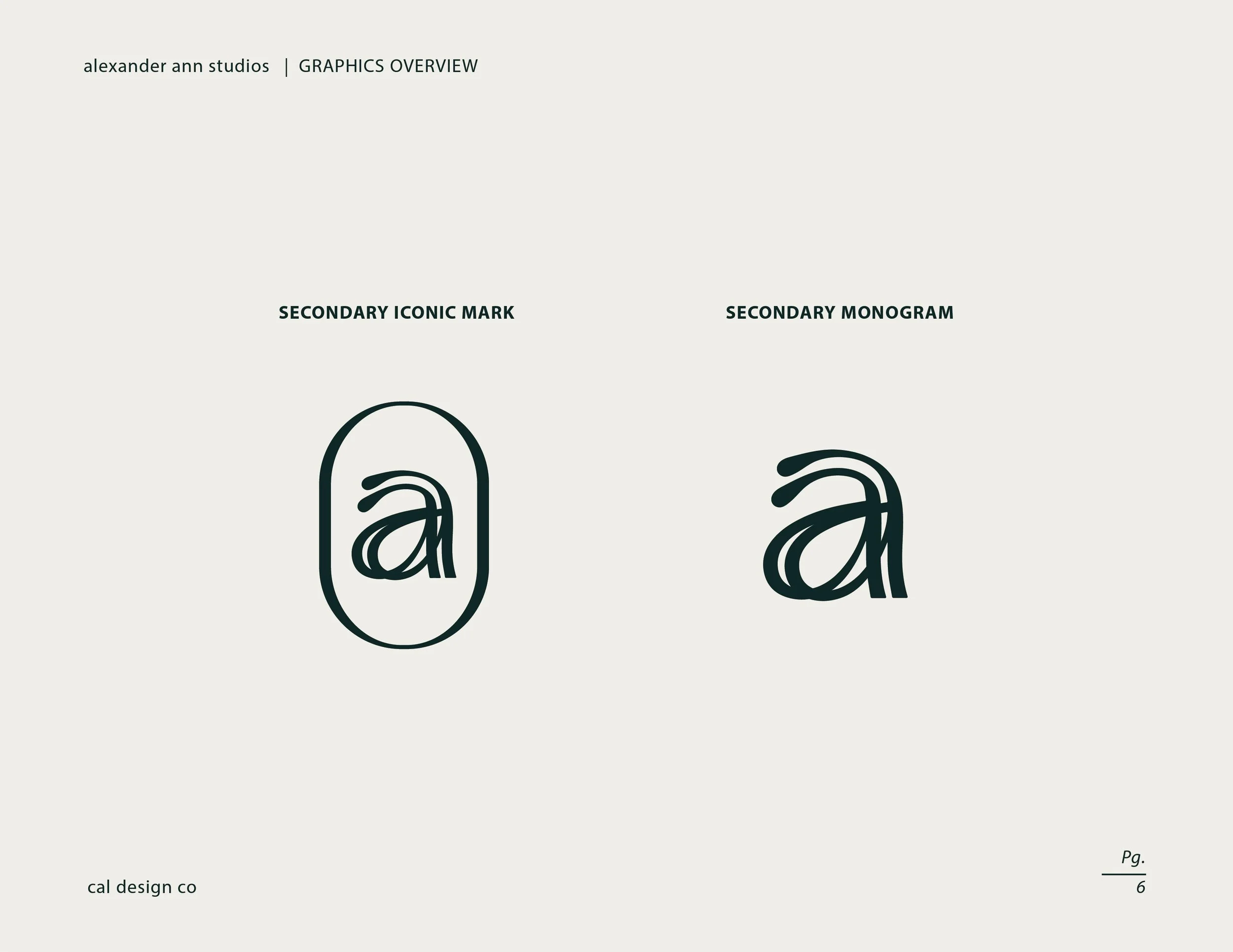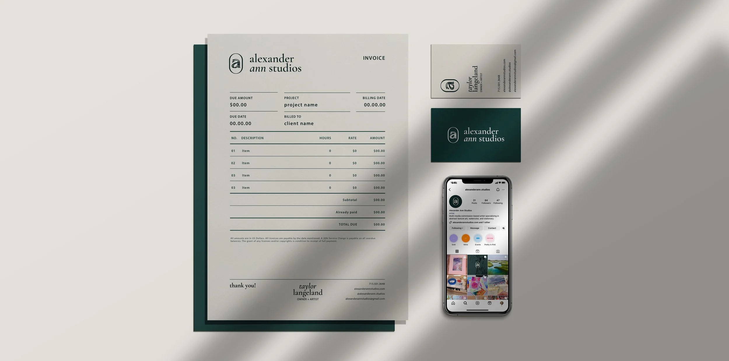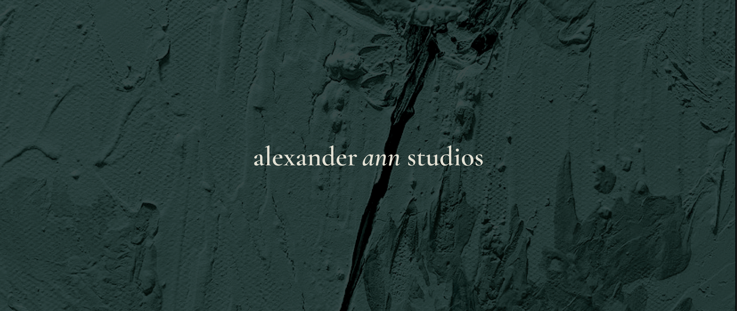
Mix of trendy and timeless plus a little bit of oil paint? Alexander ann studios wanted an upscale organic feel. Clean, simple, friendly, and elevated. The final logo direction intentionally emphasizes “ann” as a personal highlight for the client. This brand was fun to see start to finish - starting as paper sketches and ending as a stamp on the back of a painting! The challenge for me was finding a balance between trendy and timeless, as well as designing a memorable mark.